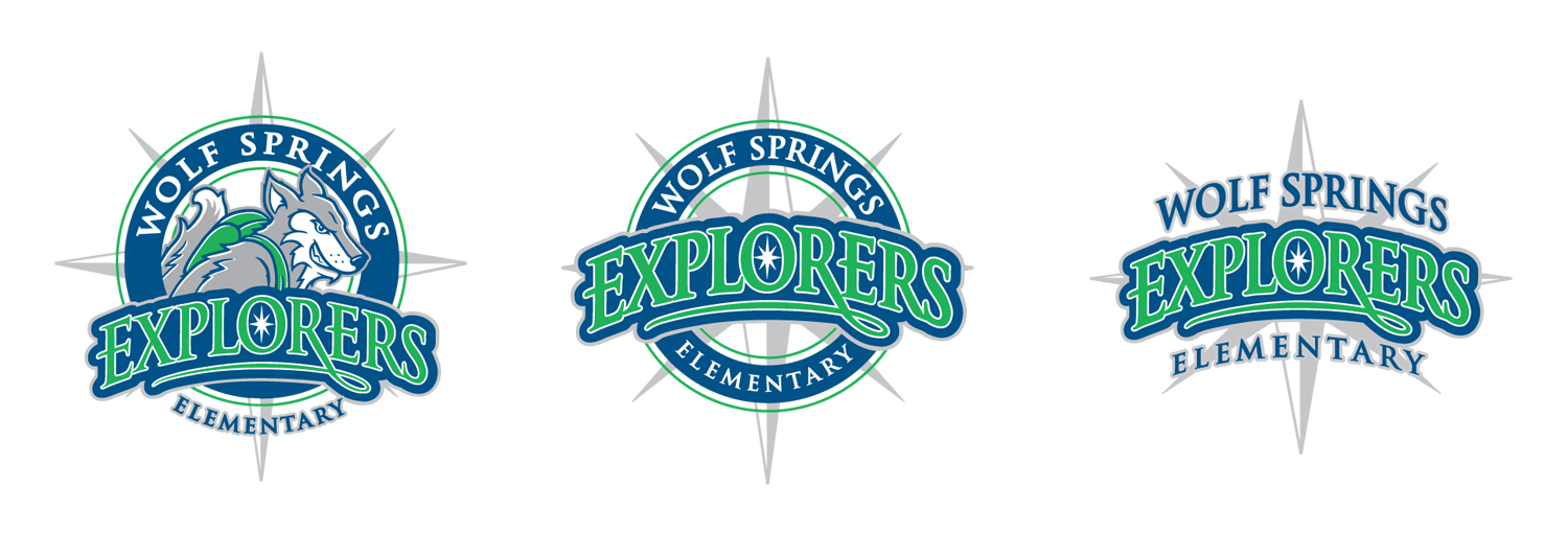
This was a logo for a new Blue Valley School. The School wanted a wolf carrying a back pack to tie in to the Explorers name. So, I drew this wolf, added the circle, put Explorers on an arc, and I also added the compass to add to the concept. Above are three versions of the logo.

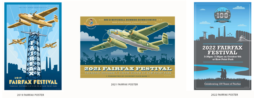
These are 11×17 Festival posters I created for the Kansas City Fairfax District. I created all the illustrations, lettering and the 100 year logo. You can go to the Fairfax Industrial Association website at https://fiakck.org/ to view how some of my artwork was utilized digitally.

Above are some examples of my brochure and packet work. Just showing the covers but there was a lot of promo material as well like invites, tickets, sponsor forms and table signs. These clients include: The Kennedy Center of Performing Arts, GMDC Global Summit, and the Boys & Girls Club.

This is a small sampling of the lasered metal signs I designed for Rooted Steel. It included everyday signs, Holiday signs, personalized initial signs, and trendy icons.

My calligraphy and lettering work has been featured in the Letter Art Review magazine- a prestigious international letter arts magazine. The first two magazines exclusively featured my work on the cover with an inside article.
